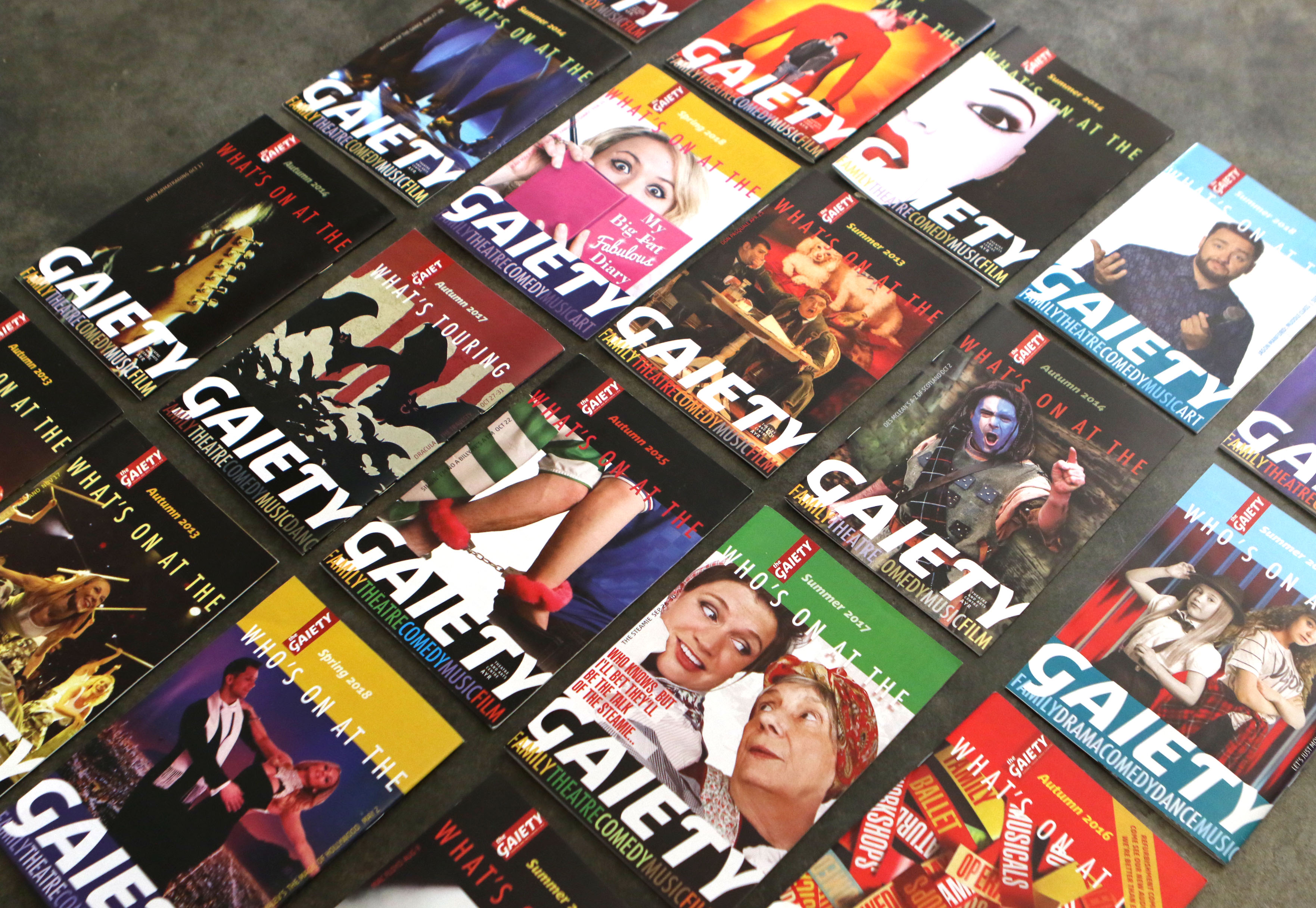
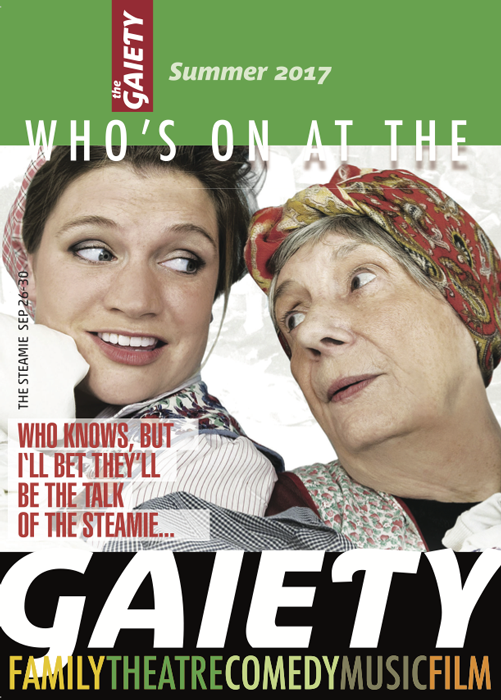
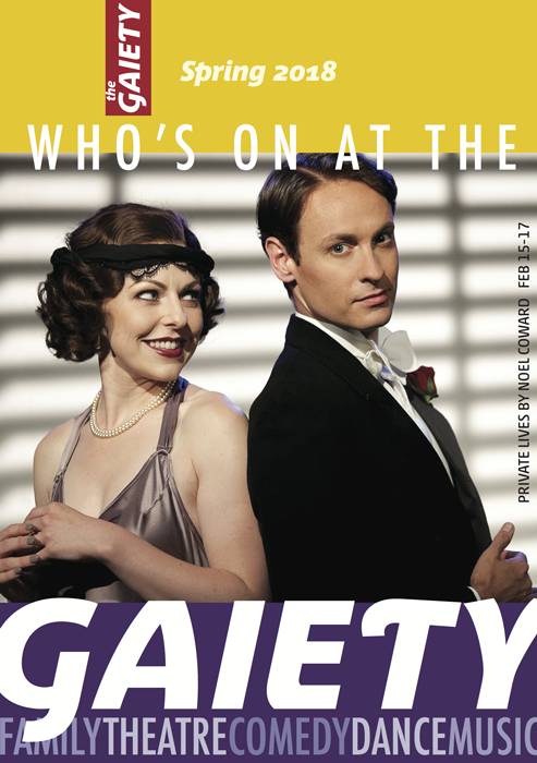
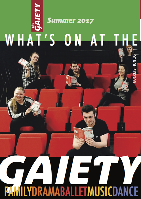
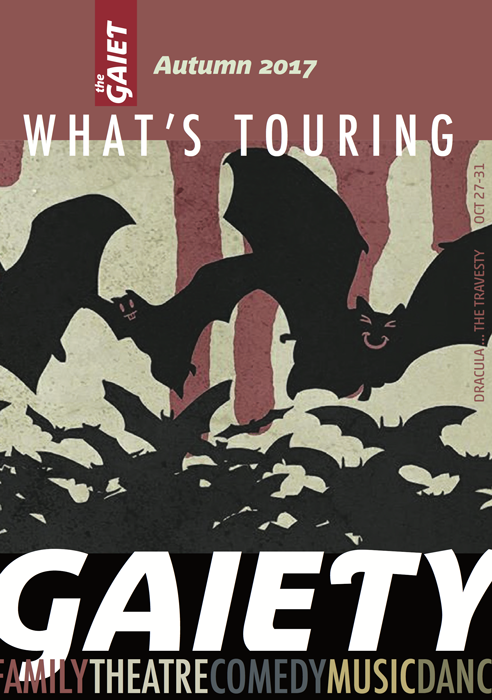
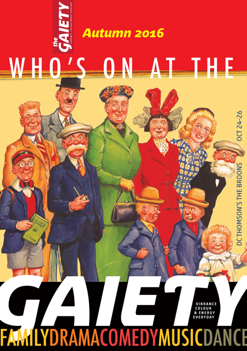
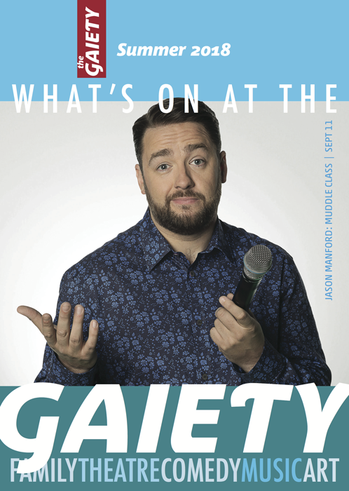
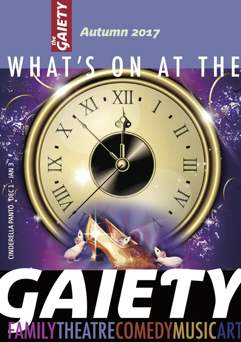
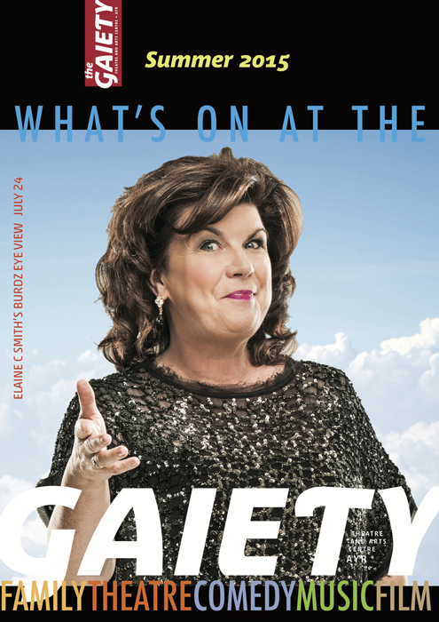
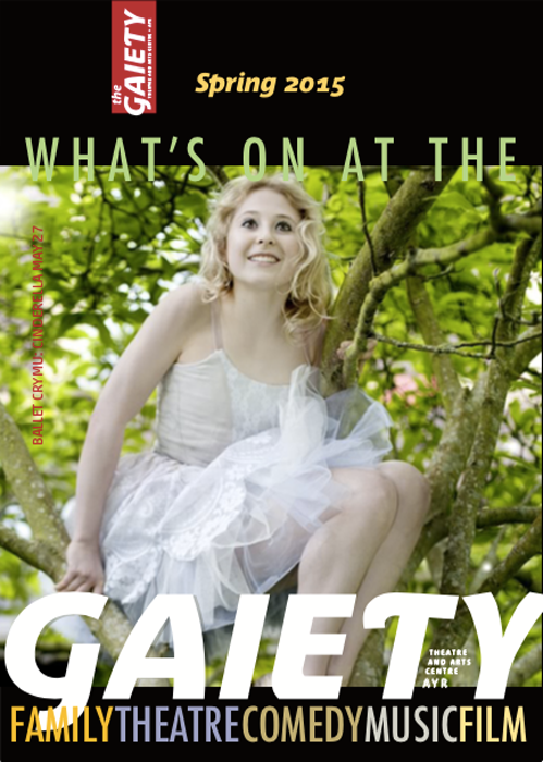
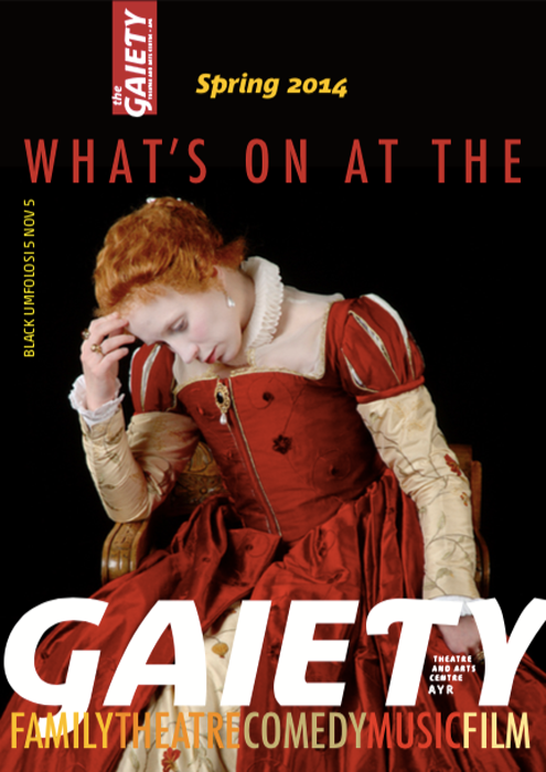
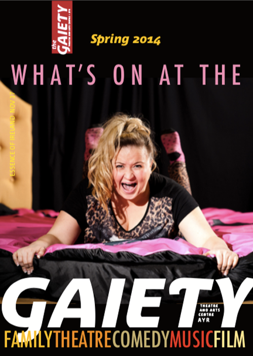
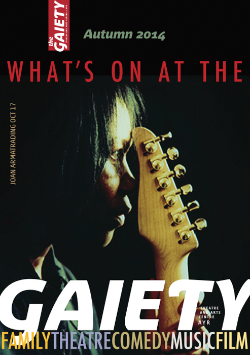
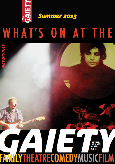
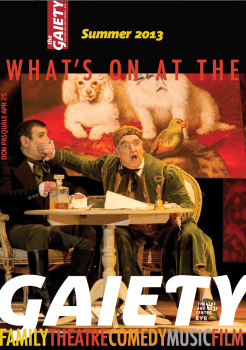
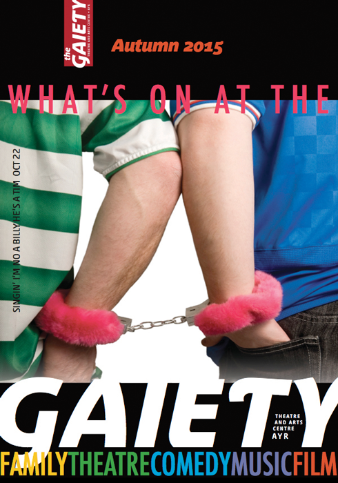
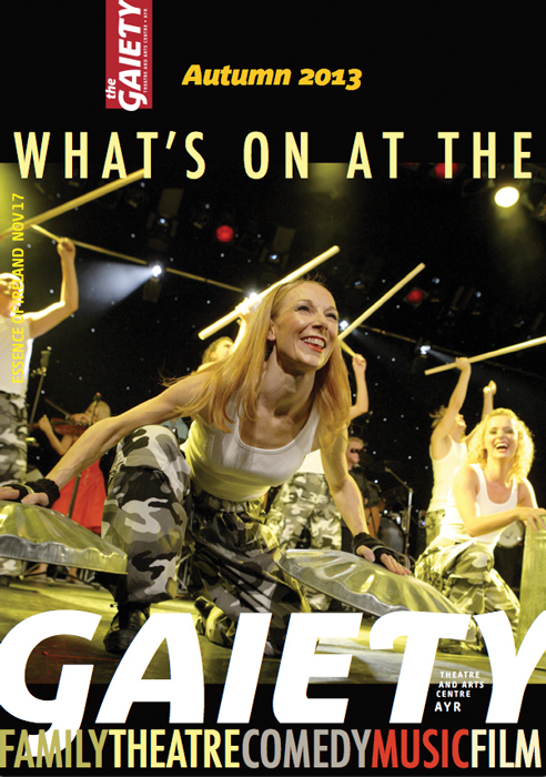
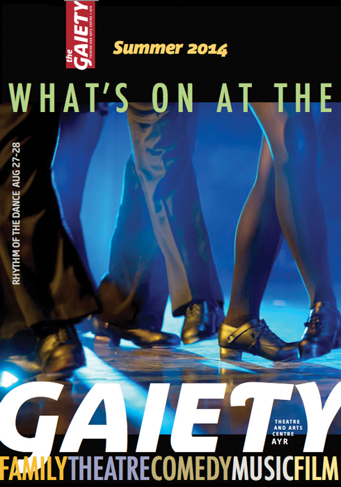
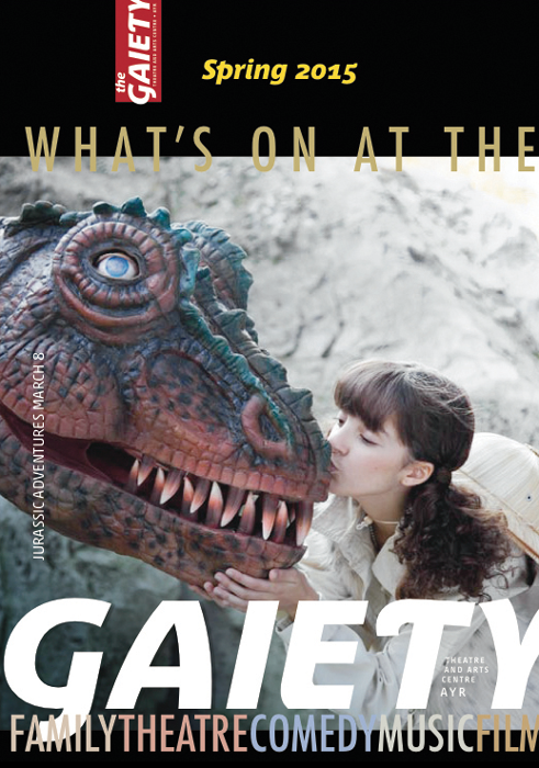
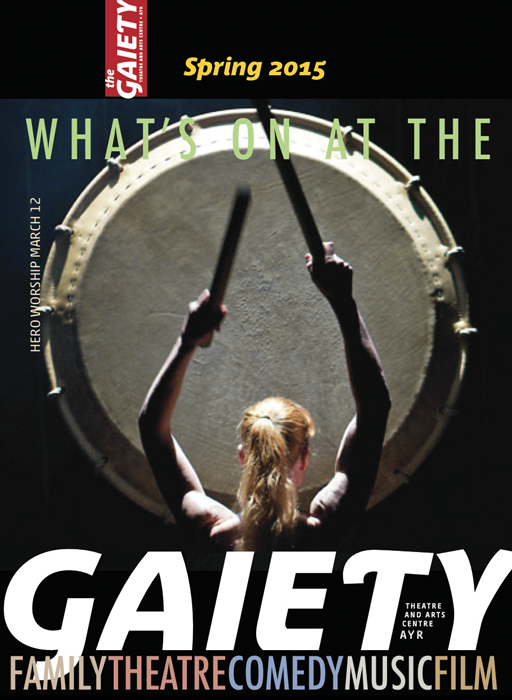
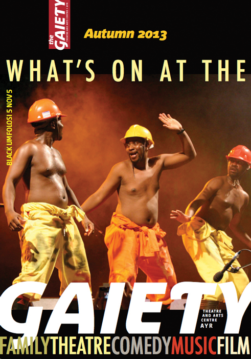
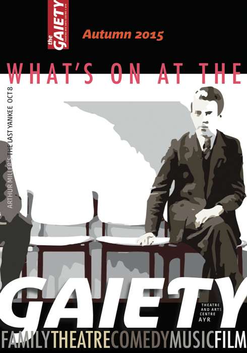
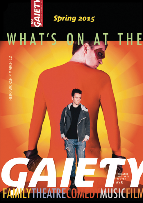
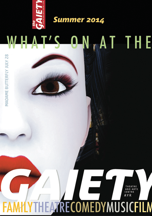
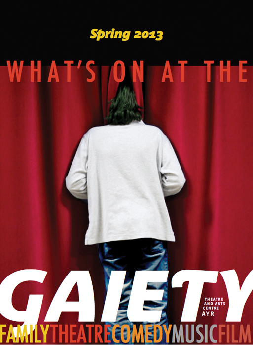
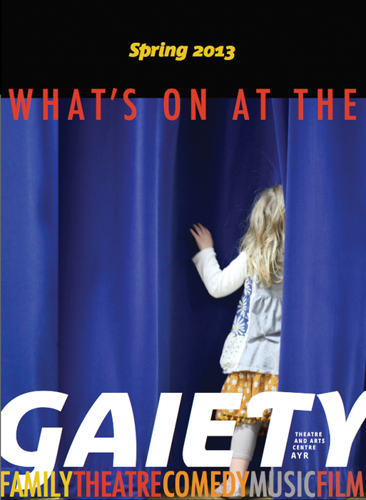
The most innovative idea for the Gaiety programs was to have two front covers. I recognized that with a diverse audience and a diverse program, as is typical for community theaters, it was advantageous to have to take advantage of both opportunities – front and back cover and offer two different propositions equally.
The newly reopened Gaiety was an unknown and to mitigate pigeonholing, this approach spoke to the diversity of their program. The program could be displayed both ways. Depending on your preference you would reach for the program featuring the show you were drawn to. So rather than dismissing the offering because it didn’t interest you they doubled their chances of connecting and engaging with you by presenting two very different options.
On the “back” front cover I could get away with a more avant garde or more niche appeal shows while the front satisfied the theater’s need for something with a broader appeal. A perfect balance that reflected their offering.
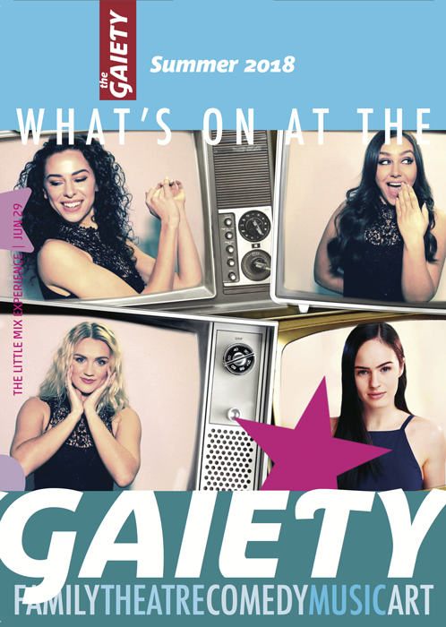
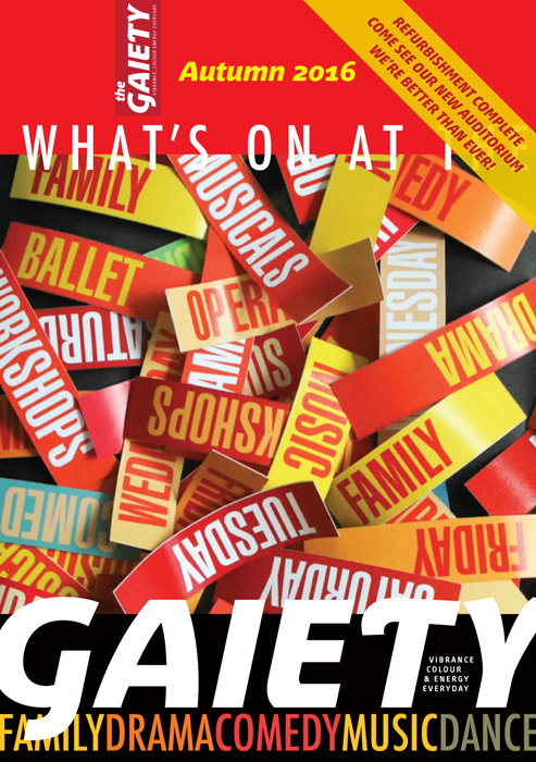
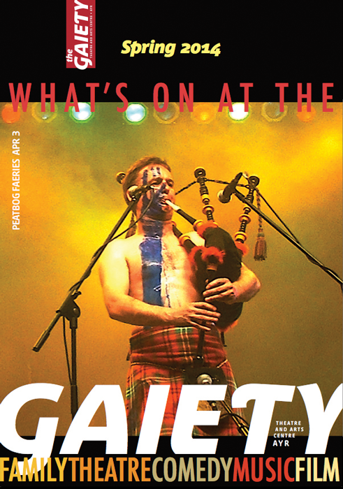
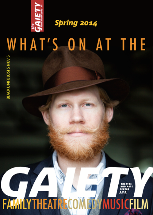
One noticeable design change happened when the refurbishment was totally completed. I replaced the black background of the masthead with bright flat colors to signal this important and final stage.

