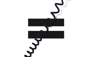
I redesigned USA’s popular fantasy sports game logo in the summer of 2015. The original mark had become hard to read in many of the modern digital applications and I was approached to redesign it. I wanted to create more harmony in the center of the mark and at the same time create an icon that could work on its own. The circle and the two dashes when combined represented two opposing sides to me. Like two teams competing. It also looked like a face.
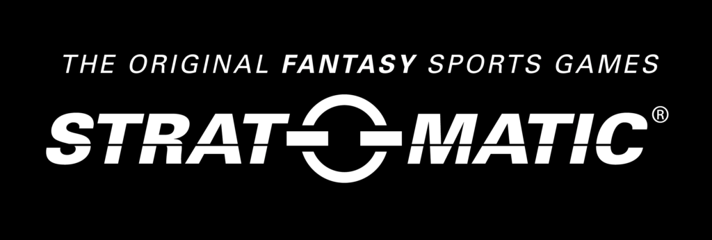
New logo
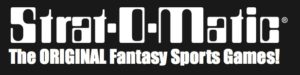
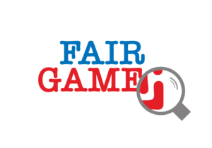
Old logo
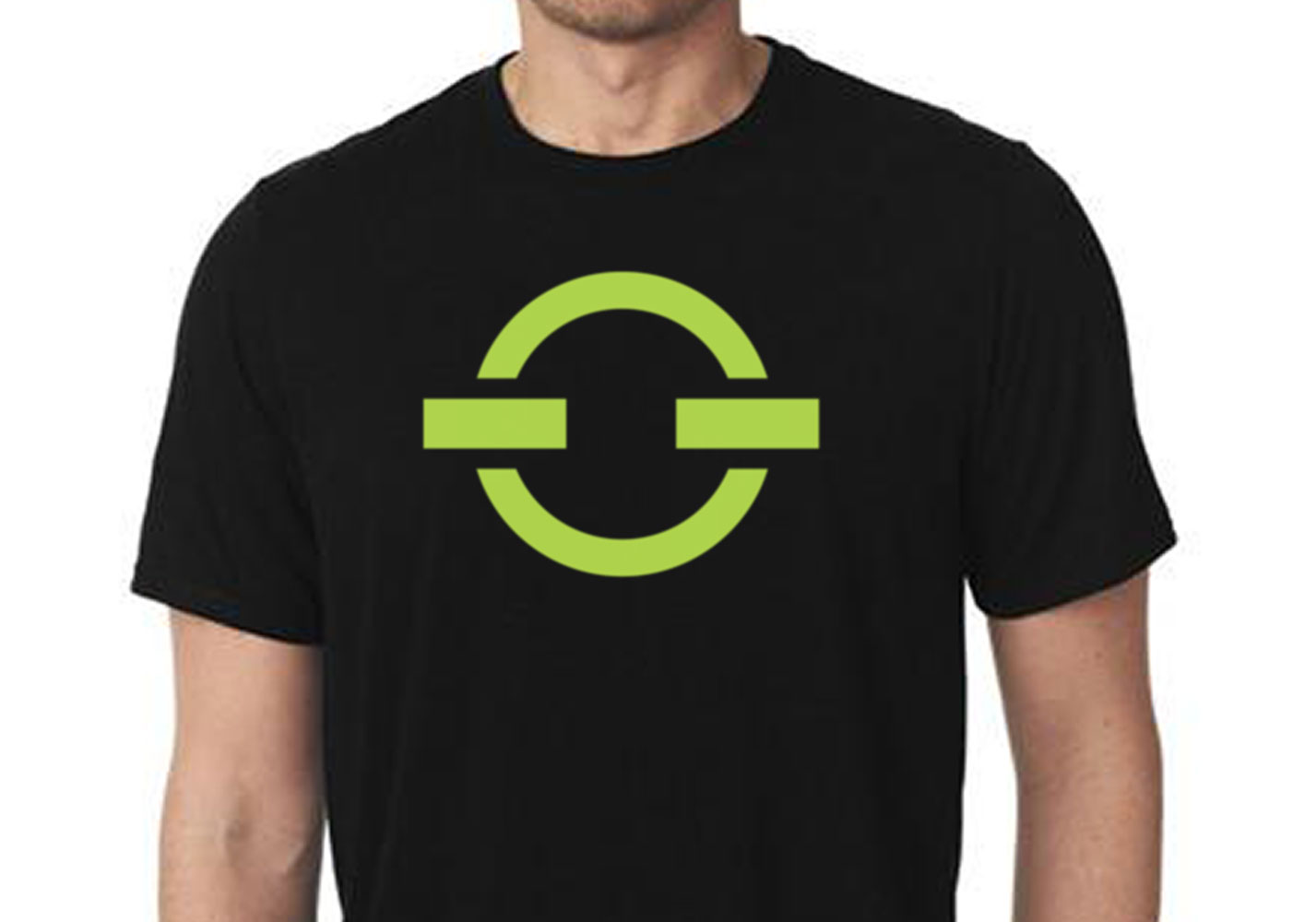
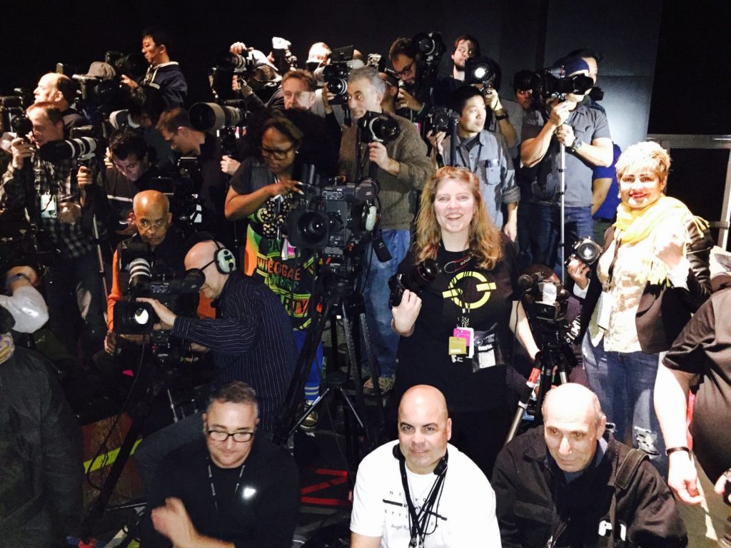
I wanted something highly visible that would make a great T-shirt. See below, I am wearing a new shirt on the riser at New York Fashion Week.