Skip to content
Menu
About Maas
Recent
Portfolio
Skills
Costs
E
Logos
Archives
Logo/Corporate Identity/ Brand Mark planning
May 2, 2021
Read More »
Branded Illustration Style for News Coverage
August 28, 2020
Read More »
Strat-o-matic – Logo Redesign
June 29, 2020
Read More »
Fair Game Logo
May 27, 2020
Read More »
Westchester Hebrew High School logo
May 24, 2020
Read More »
It’s All One – Logo
May 23, 2020
Read More »
US Powergen Logo
May 23, 2020
Read More »
Act Out Logo
May 19, 2020
Read More »
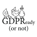
GDPR Ready or Not Logo
May 17, 2020
Read More »
The Gaiety Theatre Logo
May 17, 2020
Read More »
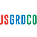
USGRDCO US Grid Company logo
May 17, 2020
Read More »
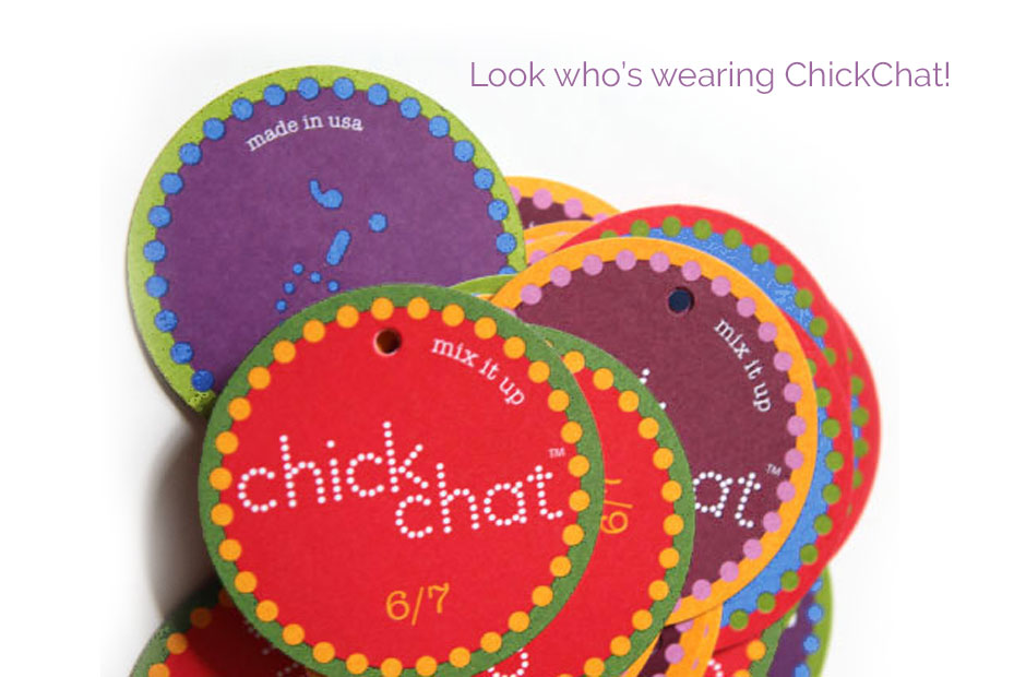
Chick Chat Clothing Logo
May 17, 2020
Read More »
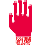
Together Let’s Stop Traffick Logo
May 17, 2020
Read More »
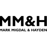
Mark Migdal & Hayden – Logo and custom illustration
May 17, 2020
Read More »
Search
Design
Private Sector
Arts and Culture
Forty Days Forty Nights
Video
Print
Logos
Digital
Art Direction
Poster
Close