Skip to content
Menu
About Maas
Recent
Portfolio
Skills
Costs
E
Private Sector
Archives
Branded Illustration Style for News Coverage
August 28, 2020
Read More »
Strat-o-matic – Logo Redesign
June 29, 2020
Read More »
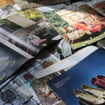
Tekserve Holiday Gifts Campaign Catalog
May 30, 2020
Read More »
Tekserve Holiday Campaign
May 27, 2020
Read More »
Fair Game Logo
May 27, 2020
Read More »
NYFW – Tadashi Shoji video
May 26, 2020
Read More »
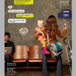
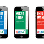
Mobile Brochures Breakthrough
May 25, 2020
Read More »
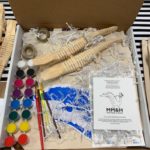
Day 32 – Eat dessert right off the table like Alinea
May 24, 2020
Read More »
American Jewelry Design Council 25th Anniversary Exhibition Catalog
May 24, 2020
Read More »
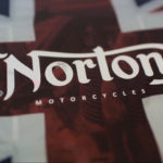
Norton Motorcycles – short film
May 24, 2020
Read More »
Day 39 – Lawsome News – email newsletter
May 24, 2020
Read More »
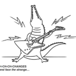
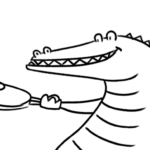
Alligator – Animated brand mascot
May 24, 2020
Read More »
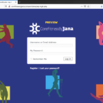
Core Fitness by Jana – membership and e-commerce website
May 24, 2020
Read More »
Art Direction for US Powergen
May 23, 2020
Read More »
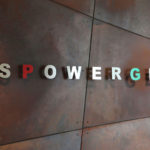
US Powergen Logo
May 23, 2020
Read More »
Art Direction for Anthropologie
May 23, 2020
Read More »
Art Direction for National Geographic Online Boutique
May 23, 2020
Read More »
Day 55 – Zoom meeting animation for social media
May 22, 2020
Read More »
Day (7) – We are here for you!
May 22, 2020
Read More »
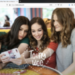
Teeny Wee – Shopify Website
May 21, 2020
Read More »
Double Nickel Entertainment website
May 21, 2020
Read More »
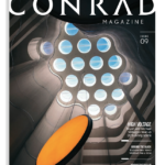
Conrad Magazine Redesign
May 21, 2020
Read More »
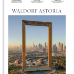
Waldorf Astoria Magazine Redesign
May 21, 2020
Read More »
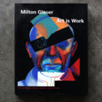
Art is Work by Milton Glaser, Book
May 20, 2020
Read More »
MM&H International Arbitration Animation
May 19, 2020
Read More »
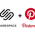
Pinterest functionality for a Squarespace website
May 18, 2020
Read More »
Day 4 – MM&H Gator Gift for house-ridden clients and friends
May 18, 2020
Read More »
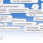
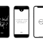
Day 24 – Who Said That? Quiz
May 17, 2020
Read More »
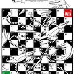
Day 20 – Snakes and Gators board game
May 17, 2020
Read More »
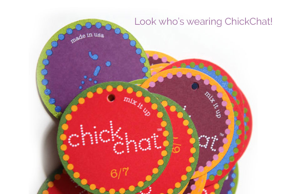
Chick Chat Clothing Logo
May 17, 2020
Read More »
Mark Migdal & Hayden – Logo and custom illustration
May 17, 2020
Read More »
It’s not the story – it’s how you tell it.
September 20, 2018
Read More »
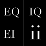
Interpersonal Intelligence for Design, Marketing and PR Communications
August 5, 2018
Read More »
Search
Design
Private Sector
Arts and Culture
Forty Days Forty Nights
Video
Print
Logos
Digital
Art Direction
Poster
Close