Skip to content
Menu
About Maas
Recent
Portfolio
Skills
Costs
E
Mentor
Archives
Day 91 – 91 years
June 26, 2020
Read More »
White Poster
May 19, 2020
Read More »
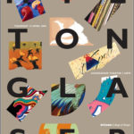
Milton Glaser – Talk Poster
May 19, 2020
Read More »
Search
Design
Private Sector
Arts and Culture
Forty Days Forty Nights
Video
Print
Logos
Digital
Art Direction
Poster
Close