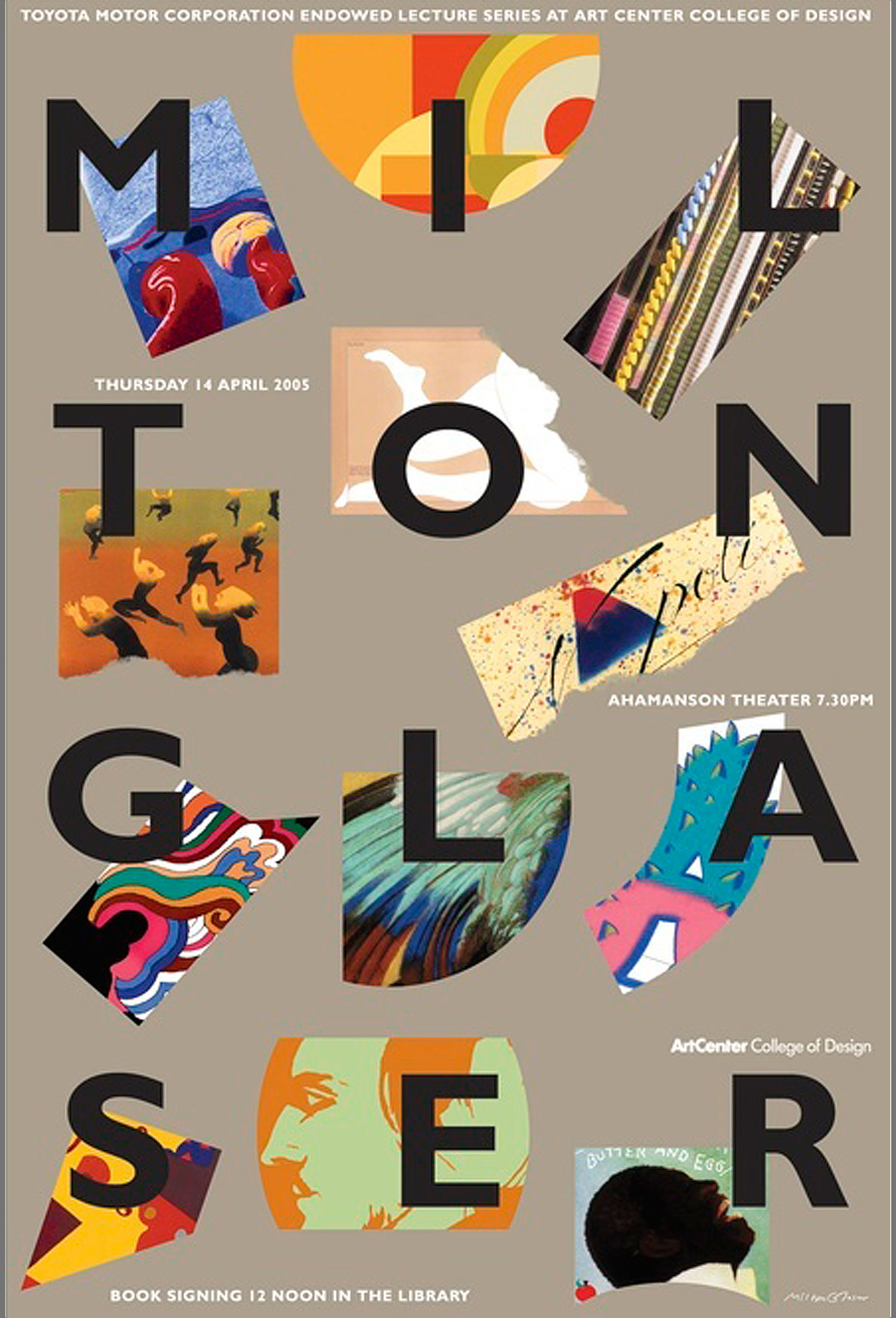
I created this poster with Milton for a talk and book signing he was giving. The poster became significant because the typography inspired Milton’s last update of his company logo in the mid 2000s.
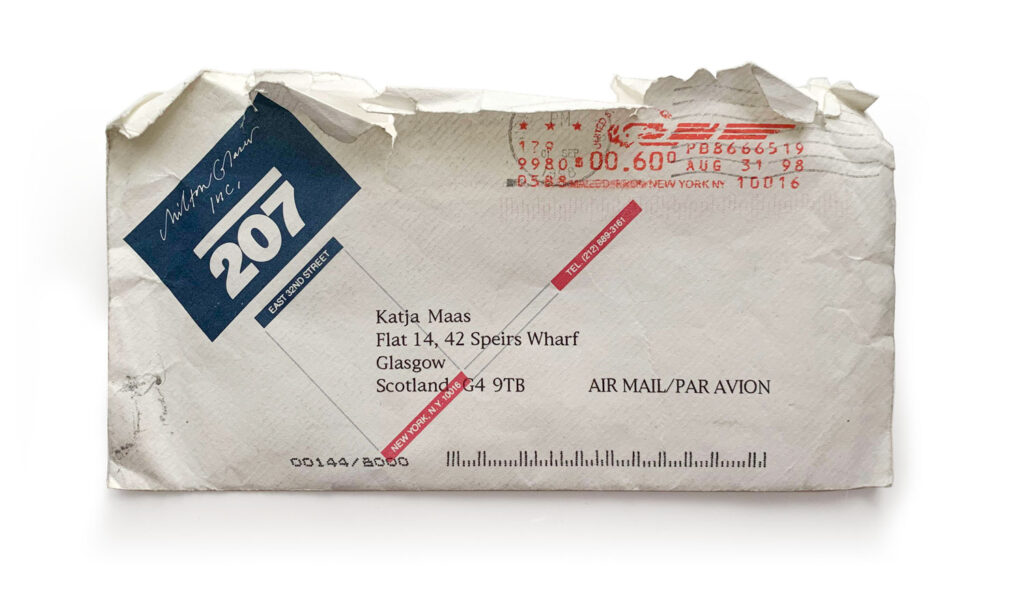
When I first visited the firm as an intern in 89 he was using this design. The concept was based on a Dada principle where you take the least important thing and make it the most important thing… As you can see on the envelope below, the street number which is normally the smallest, least important element of the brand (the name being the most important) is made the most dominant element.
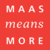
Inspired by the poster, but using a lighter weight of Gill Sans, the 2005 red logo with his name in four lines of equal length was a visual play on the pronunciation of his name. Poetically perfect in three lines of three letters, each line a perfect syllable. :-)